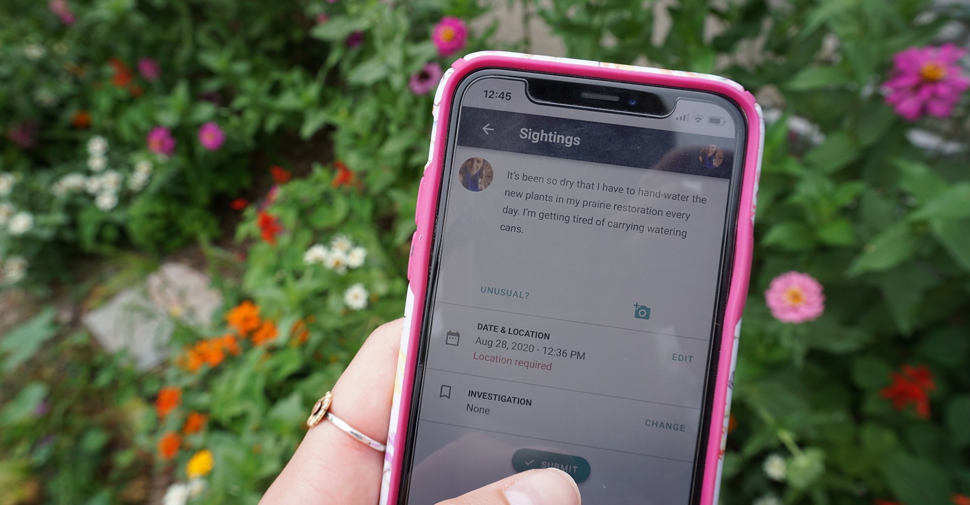
Since our founding in rural Colorado eight years ago, ISeeChange has grown into a global community of members from over 118 countries. Our technology and platform has grown as well, from a WordPress site, to a web app with a companion native, mobile app. Now we’re taking our next tech step this week by launching a new, unified version of the ISeeChange platform.
“It’s been interesting to speak to different community members and hear how many people use both the app and the website,” said Lindsey Wagner, ISeeChange lead designer. “Historically those have been pretty different codebases, but now we can truly offer a one-to-one experience. For us that obviously has tech benefits and maintenance benefits, but from a community member perspective it is just really nice to consistently know what to expect and how to do the same interactions on any device.
Over the past year our team — led by long-time ISeeChange front-end and app developer Isaac Chansky and new front-end developer Brian Carstensen (who we threw into the fire this summer, and who has been an amazing addition to our team)— set out to develop a new code framework for the ISeeChange platform.
When you log on to the website today, or to the mobile app sometime in the next week (updates often take some time to get through the app store), you will be greeted with release notes that point out new features and a few changes that you might notice.
We are really excited about this code launch and wanted to share some of our motivations for taking these steps and some of the changes you can explore. We are always open to your feedback, so feel free to reach out via email. Additionally, we’ve tested the new code extensively within our team, but we’re not perfect! If you spot a bug, report it.
Why we updated our code
We chose to unify the ISeeChange code for a couple of reasons. First, we value accessibility. We know that everyone is experiencing climate change, and we aim to continuously work to make our technology more and more inclusive. Unifying the code of the platform means that, for the first time, the experience on the ISeeChange website and mobile app are the same.
“There won’t be a situation where the app does one thing that you can’t get on the web,” Chansky said. “If you have an iPhone, cool. If you have a phone that can run a web browser, great. If you have a library computer, that’s also fine. It doesn’t really matter. That’s a huge part of us trying to meet more people where they are.”
We also wanted to make the maintenance of the platform and the development of new features easier for our technology team. We often hear great feature request ideas from community members.
“One of the things this helps us do is keep nimble and small while having a really solid foundation for bigger problems to solve down the road,” Chansky said.
The new code is built in Vue.js which Carstensen says makes it easy to think about development on the platform in pieces and makes the work more efficient. “It’s a solid framework to build on,” he said. “And the fact that the apps and the web are really based on the same code is going to make fixes in one place improve the other.”
What’s new
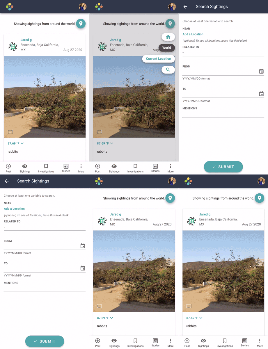 The majority of the functions of ISeeChange will essentially remain the same, with the addition of new features for filtering the sightings feed on the mobile app. But you’ll notice that things look a little different, work faster and take up less space on your phone. Here’s what has changed:
Add a sighting from any page on the app
We’ve added a plus icon in the bottom left corner of the app navigation which lets you add a new post at any point.
Filter the feed
The feed now has a button with a pin icon in the upper right corner. This button works as a one stop shop to jump from your home city, current location, and world view. You can also search the feed by geography, date, investigation and keyword on mobile! We also see opportunities to expand feed filter shortcuts in the future!
Share sightings with your friends
Let your Facebook friends and Twitter followers know what you and others are seeing by sharing your posts. Look for the three dots in the bottom right corner of a post to share on any platform you’d like.
View and manage your profile
We made a new account menu to make it easier for you to check and change your notifications settings, profile information, password and more. Access this menu through your avatar on the site and app.
View local project maps on the website
If you live in some of our areas with active partnerships and have used the ISeeChange mobile app in the past, you may have seen our local projects maps for extreme heat (Boston, and NOLA) or storms and flooding (NOLA, Miami, and Ocean City). Those are now available on the web as well as the app by navigating to the investigation and clicking on the map tab. We’ll continue to develop more mapping features for all geographies in future releases!
Pinpointed locations
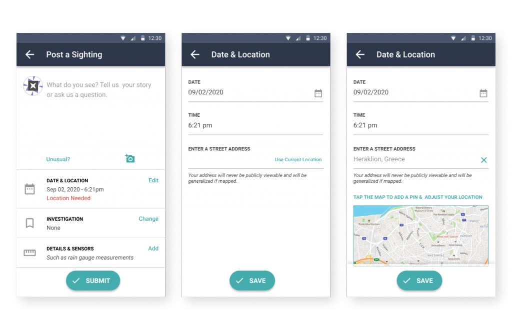
We’ve standardized our location input for sign up and posts. Now every location is recorded to an address level. We’ve made this change for two reasons 1) to reach you about local weather or ways to help and 2) to ensure we have an accurate record which can lead to improving public projects and generating solutions. The exact locations will never be public. In the feed and in maps, locations are generalized to protect your privacy but still provide useful geographic context.
What comes next
We are hopeful that this launch will make ISeeChange easier for all the members of our community to use. We also plan to regularly develop and release new features that will allow you to explore the change that you are experiencing in more detailed and community-centered ways.
Some feature ideas we have in the back of our minds include growing filtering capabilities to allow people to easily view the sightings of people that they know or want to “follow.” We have also been discussing expanding mapping and data visualization of sightings and trends.
Any new feature updates going forward will come with release notes about what’s new.
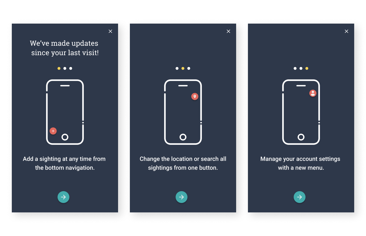
“I’m pretty pumped about the release note feature,” Wagner said. “Whenever someone updates their app or logs back into the website after we’ve released code, they’ll get a small intro into what has changed. I think that’s just a really nice touch, because it allows people to pay attention to what’s changing and give us feedback if they’re into it or not into it.”
As always, we highly value your thoughts. While the team has our own list of future features to explore, we encourage you to share your ideas with us too!

